Any time I complain to my friends about the shortcomings in iOS 7, the are quick to tell me that it’s *just* a beta. However I hold any beta that Apple releases to the same standards that I hold their software. So in this review I’m not going to review the “iOS 7 Beta” I’m reviewing the iOS 7 Beta as if it was the official release. Let me explain why I’m doing this:
I’ve been running iOS Beta updates since iOS 5. In neither iOS 5 nor 6 have I seen such blatant glitches/design mistakes. Beta operating systems released by tech giants such as Google, Apple or Microsoft aren’t half-arsed releases. Those beta releases are meant to be as close to the official version as possible. They serve two purposes. The first one is to give developers a heads start to start working with the future software (so that they can develop applications/update theirs). The next purpose is to get investors excited about that company’s future products.
Look at Windows 8 Beta for example. Everyone (including myself) said “Okay… This beta looks terrible. But it’s just a beta. It won’t look like this when it’s officially released.” Boy we couldn’t have been more wrong. The official Windows 8 release looked exactly like the beta did a year earlier.
Huge tech giants don’t release betas that don’t work or aren’t “ready for the consumer.” The official releases of iOS 5, iOS 6 and even Windows 8 all functioned and look exactly like their betas. Huge tech giants’ betas are not things that can be expected not to work. Those version are called Alpha versions.
So while you’re looking at this iOS 8 “beta” keep in mind that Apple designed it to look/function exactly like the official release will look like. Their beta was a software release that was supposed to excite investors as well as developers. It wasn’t an “in-house” test where Apple developers were still perfecting the operating system. It was a full-fledged release (and it will be reviewed as such).
Quick Note
Some critics out there (I myself am one) strongly believe that Apple has borrowed a lot of features/ideas from the jailbreaking community.
“Additionally, other improvements to iOS 7, such as “3D” backgrounds, Siri’s newfound ability to control system settings and the changes to multitasking and folders are only a handful of the new features found in iOS 7 that Apple added after receiving inspiration from the world of jailbreaking. It certainly isn’t a secret that Apple has made a habit of introducing updates to iOS that previously existed as Cydia tweaks” -evasionjailbreak.com
However, while some jailbreakers may be upset about this, I’m not. I think that it’s in Apple’s interest to “borrow” whatever successful features the jailbreak community comes up with. This is in the interest of both Apple and their customers.
If a new iPhone 4 user opened up Siri and tried to tell it to change his brightness, but she said she can’t do that, he would get pretty upset. Why wait a year or two before bringing these changes to iOS 7? I think Apple has a “trickle” plan which only releases new features at a predetermined pace. This keeps them from creating a product or software that is so good it doesn’t have to be updated for 3+ years.
Since they release a new phone every couple of years, it’s in their best interest to create products that are fresh enough at release, but get outdated by the time a new phone comes out. Personally, I don’t like this practice. The iPhone 3GS is physically able to run Siri, but Apple doesn’t allow it because they want people to just buy a new phone.
So if critics say “Apple copied features that the jailbreaking community had 2 years ago.” I say “Let them copy. But couldn’t they do it any quicker?”
iOS 7 Notifcations
The new notification drop-down has been updated to feature three different notifications tabs: Today, All and Missed. The settings that allow you to modify the notifications/widgets have also been updated to give users more flexibility. This is certainly a move in the right direction. It’s easier now to look at things that need to be taken care of immediately vs. mediocre notifications.
iOS 7 – Siri
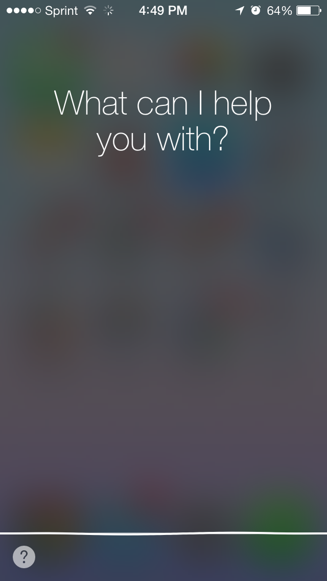
Now Siri can access the Settings. This means that Siri is now able to modify the brightness, Wi-Fi, etc. This is helpful if you don’t want to go through a settings page and a couple of click just to turn on your Wi-Fi.
The UI of Siri has also been redesigned. I also think that it processes request a bit faster; but I have not tested this vs iOS 6.
iOS 7 Messages and New Keyboard
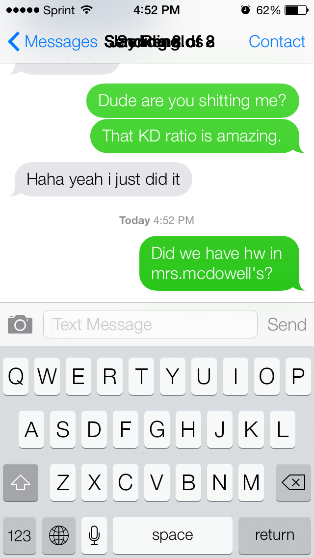
The messaging app has also been updated. However the name of the contact also overlaps with over text in the top (as you can see in the image below). I’m not really sure how something like this could have gotten past the Apple testing protocol. When scrolling through contacts or text messages, the same exact thing happens to the top bar that displays the time. The time, carrier and battery levels all lose their background, and what I see instead is the contacts or text messages behind them.
When you send a message the text is “dropped” from the text form into the conversation. It’s interesting that Apple chose to get rid of skeumorphic design but is now incorporating “skeumorphic” functionality. Also text message boxes sometimes over lap the time-stamps so much that you can’t see when the message was sent/received.
In the image above you can also see the new keyboard at work. However it’s a bit glitchy. For example: if you go into Chrome and type something in the top bar, the normal keyboard comes up. If you go to Gmail and click inside the “Username” box, then the old iOS 6 keyboard comes up with some new iOS 7 artifacts mixed in. It’s kind of an embarrassing hickup.
Also it can’t be blamed on the Chrome because Apple controls the keyboard UI. There shouldn’t be any reason for iOS 6 keyboards showing up again in any app.
iOS 7 Photo Library
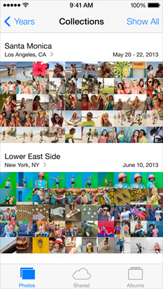
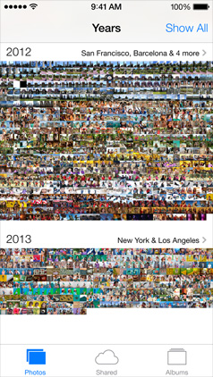
The new photo library lets you see photos sorted into the years, months or days that you took them on. Although this is an interesting feature, it’s nothing revolutionary.
iOS 7 Camera
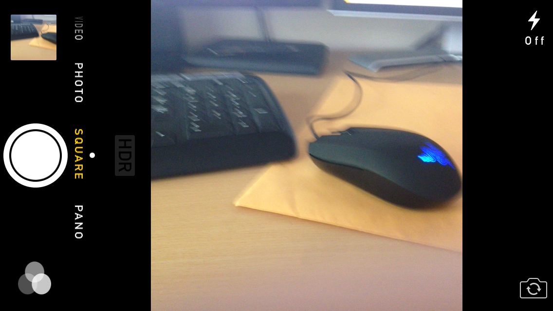
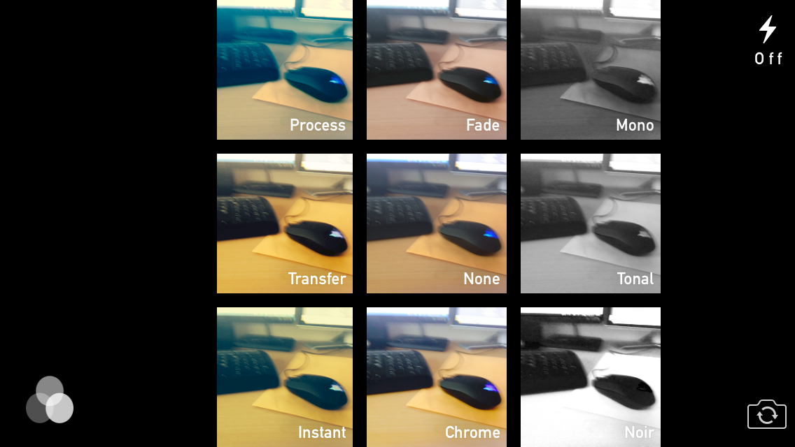
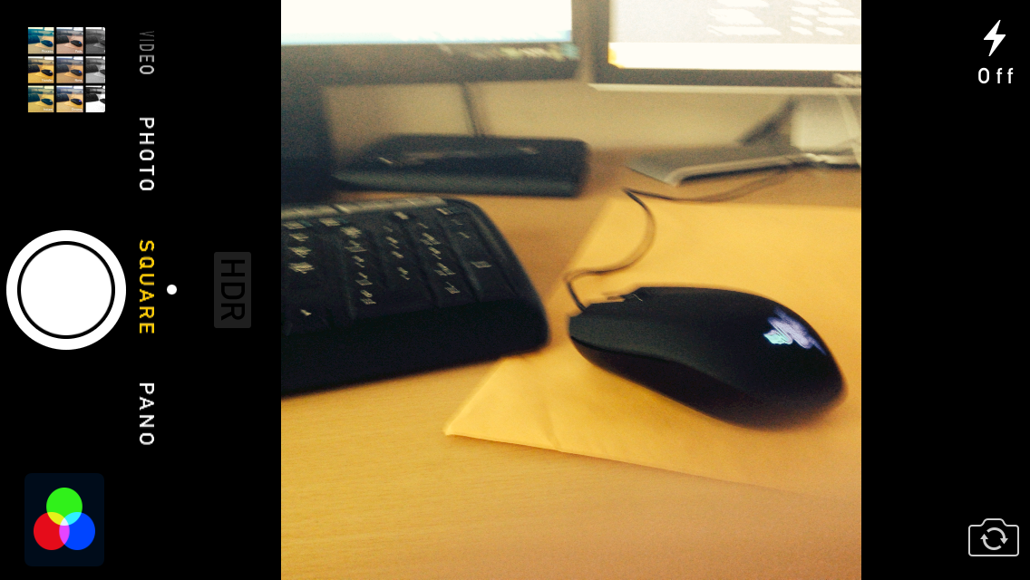
The new camera is actually pretty interesting. Sliding to the left or right lets you switch between different photo aspects, or the camera vs. the video camera. There’s also a new built-in filter feature that would have probably made Instagram’s success smaller if it was released years ago.
iOS 7 App Store
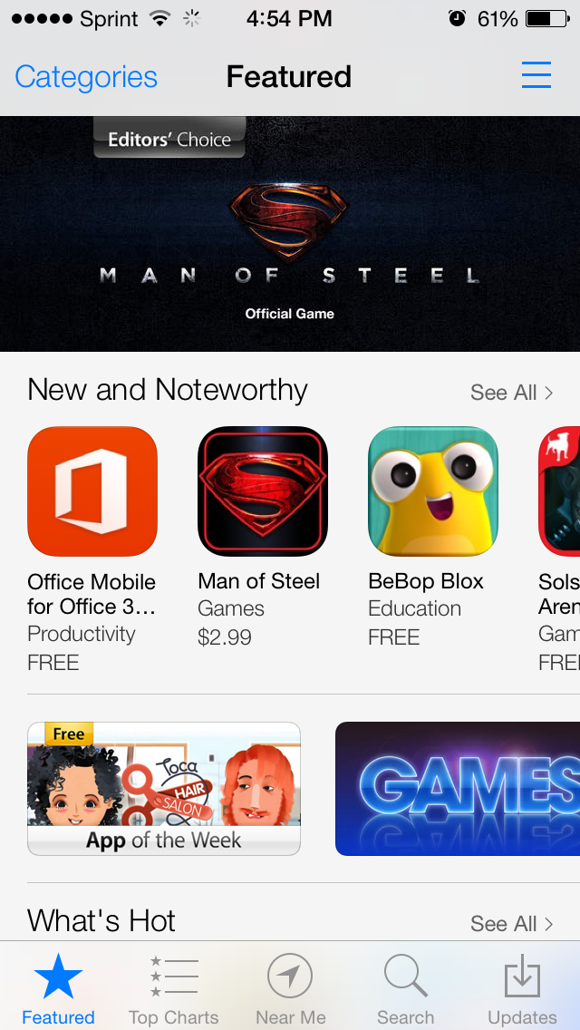
The new app store doesn’t only look really amazing, but it also functions way better than the old one. Whereas the iOS 6 app store would slow down the entire phone when installing 10+ apps at a time, iOS 7 let me install 100+ with no performance drop. You might ask why I was downloading 100+ apps. Well that’s because I was specifically testing for this. Because after every time that I restore my phone, I end up having to re-download 50+ apps, and iOS 6 would always lag. I’m glad they fixed this in iOS 7.
iOS 7 Springboard
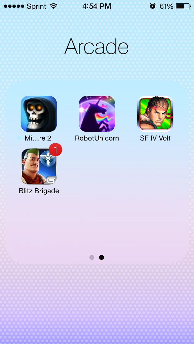
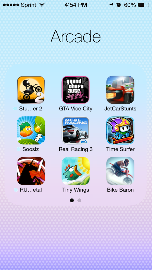
The new iOS 7 Springboard updated the folders to have pages functionality. Also when you open up new apps they kind of “expand” to fill your screen instead of just showing up. I think this new expansion animation is kind of gimmicky and I wish it would be turned off.
The expansion animation of apps also leaves notification circle graphics on the screen for a couple of seconds before disappearing.
When I saw the issue above I thought someone was trying to troll me. Never in my life would I expect something like this to show up in Apple’s beta. But apparently it did. Somehow. I can confirm that this is the official iOS 7 Beta (downloaded from Apple’s developer program and officially registered through them). Apparently no one was trolling me. This is just the beta…
Also iOS 7 only comes with 2 3D backgrounds. Which is pretty embarassing… If you’re going to release a 3D background feature at least give users the option to choose from 10+ backgrounds.
The search page is accessed by scrolling up now. Not by going all the way to the left side.
iOS 7 Reminders, Weather, Clock, Compass, Calculator and Notes
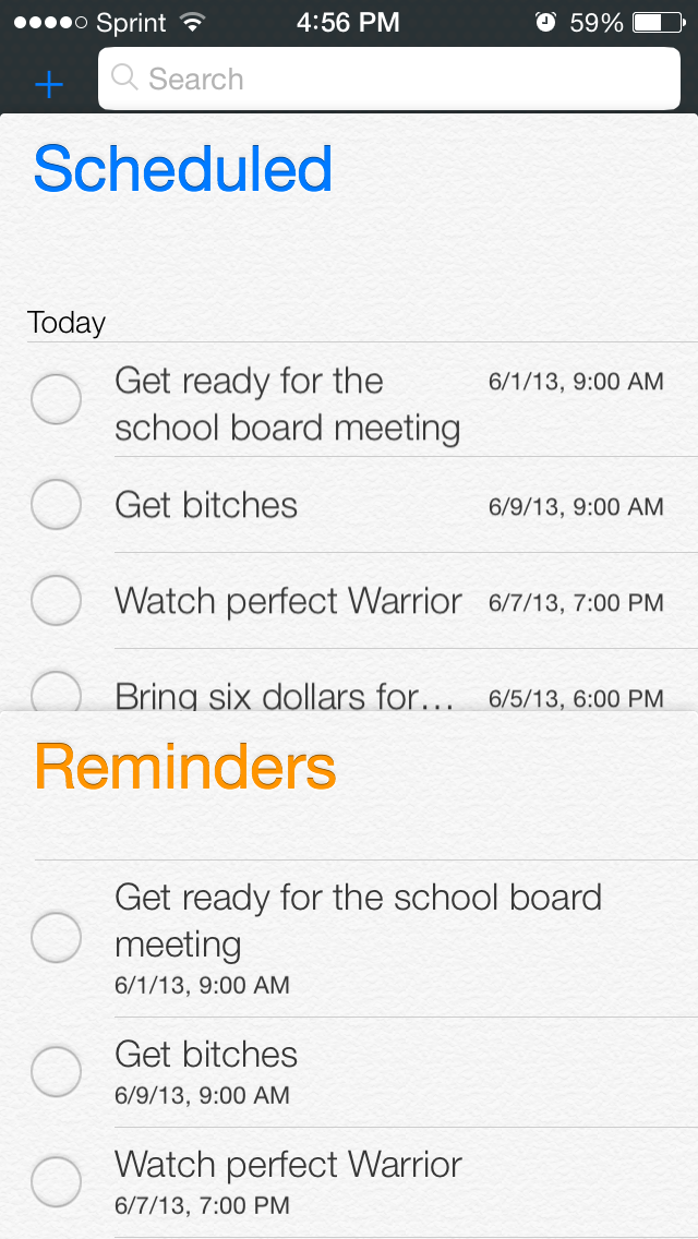
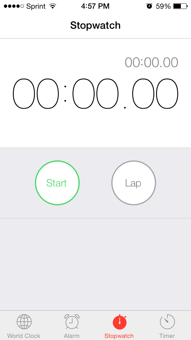
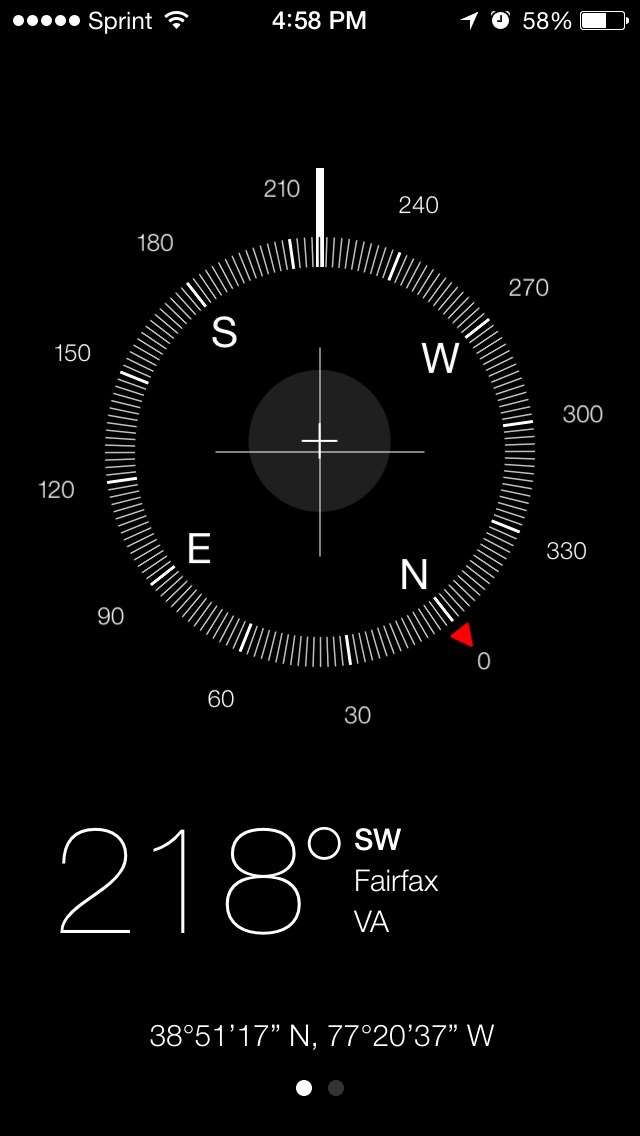
These apps have been updated to look more “flat” and to get rid of the old skeuomorphic designs left over from Steve Jobs. The run exactly the same way but look way simpler (and better in my opinion).
Call me crazy but I think Apple’s new move towards “flat” design is directly copying the simple design trend that Windows and Google have created through products such as Windows 8 and G+. The old iOS and Mac designs were based on real life things that were unnecessary in a technology design perspective. There was no need for wood shelves in the Newsstand app or yellow note paper in the Notes app. Even some Apple developers hated this skeumorhpic design:
“It’s visual masturbation,” says one former senior UI designer at Apple who worked closely with Steve Jobs. “It’s like the designers are flexing their muscles to show you how good of a visual rendering they can do of a physical object. Who cares?” –Fastcodedesign.com
“There was lots of internal email among UI designers at Apple saying this was just embarrassing, just terrible.” –Fastcodedesign.com
A Fast Company report even claimed that Steve Jobs designed Mac’s iCal leather stitching after his own private jet’s chairs. At any rate, the new design looks good. But it’s not original and it’s a bit late now. It only took Apple 7 versions of iOS to realize that their old design principles were seriously flawed.
iOS 7 Safari, Mail and Settings
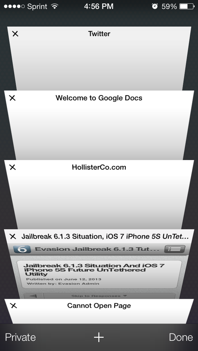
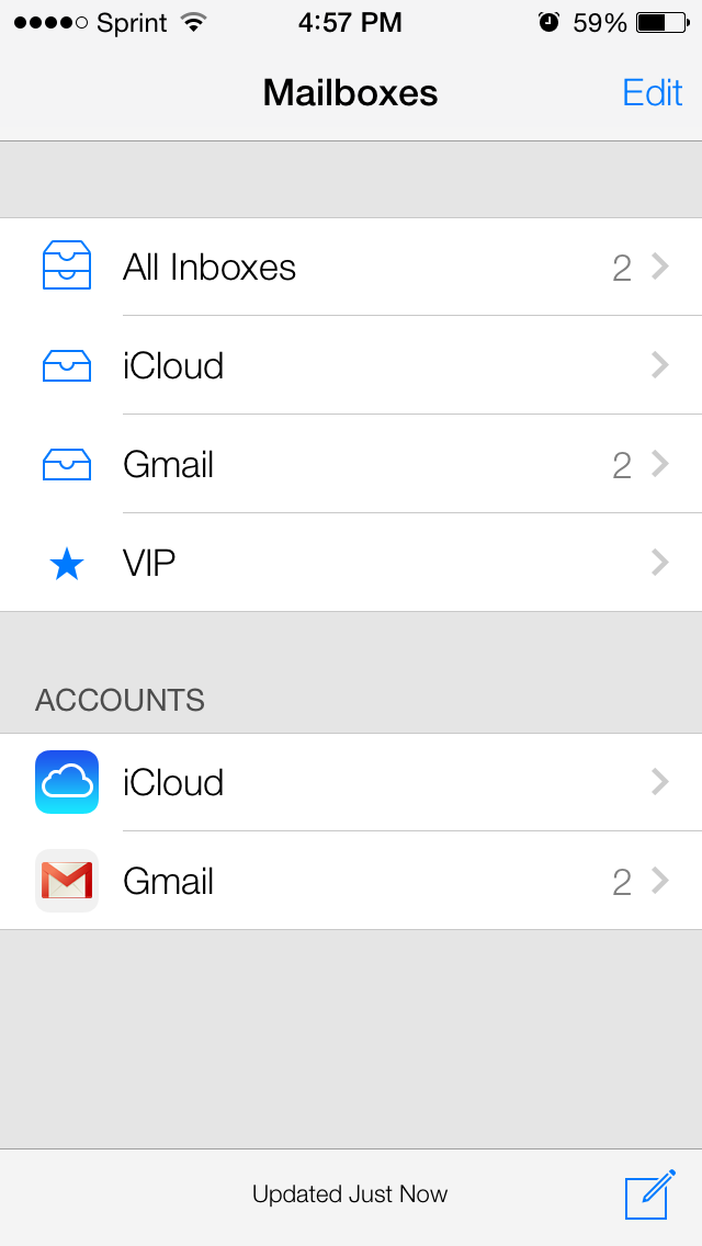
Safari now has a cool way of switching in-between open tabs. Also the mail app’s design has been updated. Although there’s no image of the settings below, it looks exactly like the mail design.
iOS 7 Phone
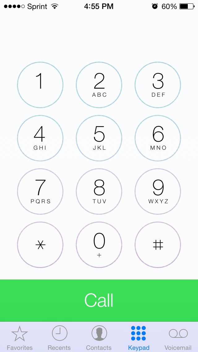
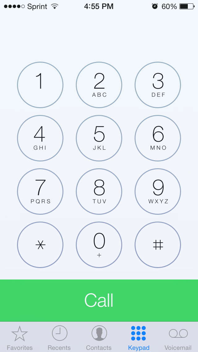
The new phone design looks great. However when I open up the phone app, the bottom call button flashes different shades of green. I don’t think it was designed to do this. Even if it was, it looks terrible when it does this.
iOS 7 Control Center
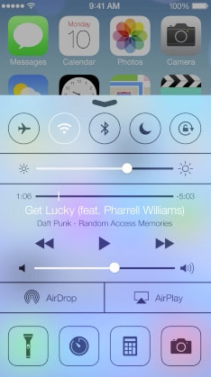
Apple is taking their copy writing to a whole new level these days. On the iOS 7 Beta page, they claim that “Never has one swipe given you so much control.” Which is pretty much a lie seeing that Android has had this functionality now for many years. It’s just like their marketing slogans “The best thing to happen to the iPhone, since the iPhone.” That’s like saying “The best NASA rocket to be built, since the first NASA rocket to be built.” Hmmm… That really gives you a lot of room for comparison. But I’m not going to go into those marketing topics now.
iOS 7 Multitasking
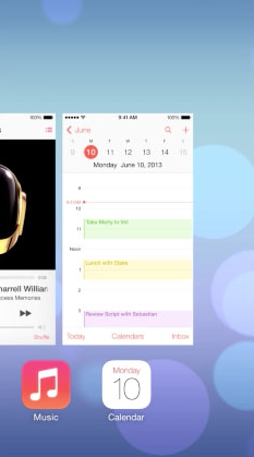
The new multitasking feature lets you preview apps as well as swipe to close them. This is pretty cool. Except Android’s had the same exact feature for years as well.
More Interesting Bugs
http://www.youtube.com/watch?v=X7O-fJbDlFw
Conclusion
I use an iPhone 5 running the official iOS 7 Beta and an iPhone 4 running iOS 6.1.3. The first thing I want to say is that no matter how many glitches iOS 7 seems to have, the benefits overcome the downsides. When I used iOS 6 now it feels outdated. It’s been 6 years since the iOS design was released. The 6th version looks exactly the same as the 1st. So obviously iOS 6 will feel a lot more outdated than iOS 7 which came out a month ago. I could never go back to the previous version now and feel satisfied.
However, iOS 7 isn’t that good either. It’s like Windows XP and Windows 8. If you upgraded to Windows 8 you’d never downgrade back to XP, but at the same time you know that Windows 8 isn’t a good solution either. I’m just left feeling like Apple has disappointing me more than it ever has with this new iOS release.
In my review I might have seemed to only focus on the bugs and downsides. Let me tell you this though: I purchased an iPhone 5 last month so I don’t have to deal with the bugs/quirks in Android.
My first smart device was an iPod Touch 1st generation. But I’ve also owned an Android phone in the past and used it as my primary phone. I don’t side with either Apple or Android. I just use what works. Whereas Apple always used to be the reliable phone, I’m starting to rethink that now.
I bought an iPhone so I didn’t have to deal with Android phones’ low quality (both in the phone builds and software). Yet it seems like now Apple is bringing all of those problems to their phones. The control center is a perfect example. I have 0 songs on my phone because I always use Pandora. However when I pull up the Control Center I still see the media player. I still see the 0:00 (timing for songs) even though I don’t have any songs on there. There’s no reason to see the forward or rewind buttons either.
If you don’t believe me when I say that Apple is borrowing things from Android, then look into the lawsuit they recently lost. Apple is no longer allowed to import iPhone 4, iPhone 3GS, iPad 3G and iPad 2 3G, specifically because they copied Samsung.
To sum it up: I’d expect blatant software glitches in Android beta versions, but not from Apple. That’s why I’m seriously reconsidering purchasing iPhones in the future.
Article written by Octavian Ristea.
